> [!NOTE]
> **Note:** Styles are `@Experimental` and likely to change in upcoming releases, with Material support for Styles added in future releases. If you have any feedback, [file Styles issues](https://issuetracker.google.com/issues/new?component=612128).
There are several ways you can build out your apps using Styles. What you choose
depends on where your app sits in relation to its adoption of Material Design:
1. Fully custom design system, not using Material Design
- **Recommendation**: Define component styles that consume values from the theme, and expose style parameters on design system components.
2. Using Material Design
- **Recommendation**: Await Material adoption to integrate with Styles. Use styles on your own components where possible.
## Android skills
[View on GitHub](https://github.com/android/skills/blob/main/jetpack-compose/theming/styles)
### Use the Jetpack Compose Styles API
Use the `styles` [Android skill](https://developer.android.com/tools/agents/android-skills) to create and customize components with the Styles API. To install the skill from the [Android CLI](https://developer.android.com/tools/agents/android-cli), run:
android skills add styles
## The Style layer
In the traditional Compose model, customization often relies heavily on
overriding global tokens (colors and typography) provided by `MaterialTheme`, or
wrapping and overriding properties of a design system composable where possible.
Sometimes, there are properties within the Material layer that are not exposed
through the subsystems or parameters, but are hardcoded defaults on the
component itself.
With the Styles API, there's a new layer of abstraction that's a bridge between
subsystems and components: **Styles**.
| Layer | Responsibility | Example |
|---|---|---|
| **Subsystem values** | Named values | `val Primary = Color(0xFF34A85E)` |
| **Atomic Styles** | Style that does exactly one property change | `val largeSizeAtomic = Style { size(100.dp, 40.dp) }` |
| **Component Styles** | Component-specific configurations | A Button with Primary background and 16dp padding. `val buttonStyle = Style { contentPadding(16.dp) shape(RoundedCornerShape(8.dp)) background(Color.Blue) }` |
| **Components** | The functional UI element that consumes a Style. | `Button(style = buttonStyle) { ... }` |
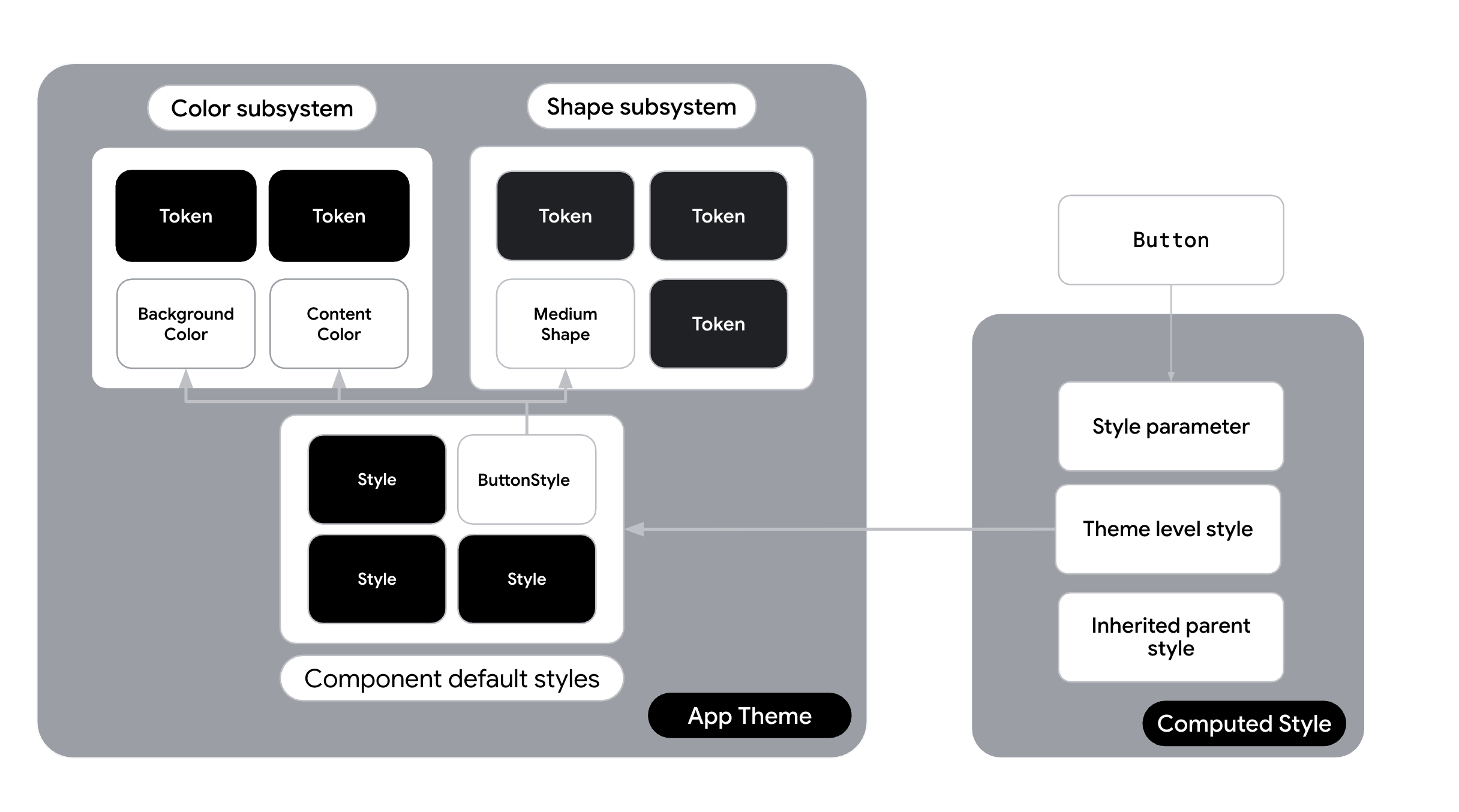 **Figure 1.** An example of a component and how it accesses styles from a theme.
### Atomic versus monolithic Styles
With the Styles API, you can break down a Style into separate atomic styles.
Instead of defining complex, component-specific styles like `baseButtonStyle`,
you can also create small, single-purpose utility styles. These act as your
"atoms".
```kotlin
// Define single-purpose "atomic" styles
val paddingAtomic = Style {
contentPadding(16.dp)
}
val roundedCornerShapeAtomic = Style {
shape(RoundedCornerShape(8.dp))
}
val primaryBackgroundAtomic = Style {
background(Color.Blue)
}
val largeSizeAtomic = Style {
size(100.dp, 40.dp)
}
val interactiveShadowAtomic = Style {
hovered {
animate {
dropShadow(
Shadow(
offset = DpOffset(
0.dp,
0.dp
),
radius = 2.dp,
spread = 0.dp,
color = Color.Blue,
)
)
}
}
}
```
#### Composition using "then"
The `then` operator in the Styles API lets you merge multiple `Style` objects.
This lets you build a component using atomic utility classes.
**Traditional (non-atomic)**:
```kotlin
// One large monolithic style
val buttonStyle = Style {
contentPadding(16.dp)
shape(RoundedCornerShape(8.dp))
background(Color.Blue)
}
```
**Atomic refactor**:
```kotlin
// Combine atoms to create the final appearance
val buttonStyle = paddingAtomic then roundedCornerShapeAtomic then primaryBackgroundAtomic then interactiveShadowAtomic
```
## Adopt Styles in your design system
Consider the following options when adopting Styles within your design system,
depending on where in the spectrum your design system lies.
### Custom design system with Styles
***Consider when**: You've been handed an extensive brand guide that is not
based on Material Design, and you are not planning to use Material Design*.
***Strategy**: Implement a fully custom design system, and expose styles as part
of the theme*.
This option is the custom path if you don't use Material as your main design
system language. You bypass `MaterialTheme` entirely for visual definitions and
have created your [own custom theme already](https://developer.android.com/develop/ui/compose/designsystems/custom#implementing-fully-custom). You build a `CompanyTheme` that
acts as a container for your Styles.
- **How it works** : Create a `CompanyTheme` object that holds `Style` objects for every component in your system. Your components (either wrappers around Material logic or custom `Box` or `Layout` implementations) consume these styles directly, and expose a `Style` parameter for consumers of your design system.
- **The Style layer**: Styles are the primary definition of your design system. Tokens are named variables fed into these styles. This allows for deep customization, such as defining unique animations for state changes (for example, animating scale and color on press).
If you are building out your own [custom theme](https://developer.android.com/develop/ui/compose/designsystems/custom) without using Material, and
want to adopt styles, add your list of styles to your Theme. This lets you
access your base styles from anywhere in your project.
1. Create a `Styles` class that stores the various styles in your application
and create the defaults. For example, in the Jetsnack app - the class is
named `JetsnackStyles`:
```kotlin
object JetsnackStyles{
val buttonStyle: Style = Style {
shape(shapes.medium)
background(colors.brand)
contentColor(colors.textPrimary)
contentPaddingVertical(8.dp)
contentPaddingHorizontal(24.dp)
textStyle(typography.labelLarge)
disabled {
animate {
background(colors.brandSecondary)
}
}
}
val cardStyle: Style = Style {
shape(shapes.medium)
background(colors.uiBackground)
contentColor(colors.textPrimary)
}
}
```
2. Provide `Styles` as part of your overall theme, and expose helper extension
functions on `StyleScope` to access the subsystems:
```kotlin
@Immutable
class JetsnackTheme(
val colors: JetsnackColors = LightJetsnackColors,
val typography: androidx.compose.material3.Typography = androidx.compose.material3.Typography(),
val shapes: Shapes = Shapes()
) {
companion object {
val colors: JetsnackColors
@Composable @ReadOnlyComposable
get() = LocalJetsnackTheme.current.colors
val typography: androidx.compose.material3.Typography
@Composable @ReadOnlyComposable
get() = LocalJetsnackTheme.current.typography
val shapes: Shapes
@Composable @ReadOnlyComposable
get() = LocalJetsnackTheme.current.shapes
val styles: JetsnackStyles = JetsnackStyles
val LocalJetsnackTheme: ProvidableCompositionLocal
get() = LocalJetsnackThemeInstance
}
}
val StyleScope.colors: JetsnackColors
get() = LocalJetsnackTheme.currentValue.colors
val StyleScope.typography: androidx.compose.material3.Typography
get() = LocalJetsnackTheme.currentValue.typography
val StyleScope.shapes: Shapes
get() = LocalJetsnackTheme.currentValue.shapes
internal val LocalJetsnackThemeInstance = staticCompositionLocalOf { JetsnackTheme() }
@Composable
fun JetsnackTheme(darkTheme: Boolean = isSystemInDarkTheme(), content: @Composable () -> Unit) {
val colors = if (darkTheme) DarkJetsnackColors else LightJetsnackColors
val theme = JetsnackTheme(colors = colors)
CompositionLocalProvider(
LocalJetsnackTheme provides theme,
) {
MaterialTheme(
typography = LocalJetsnackTheme.current.typography,
shapes = LocalJetsnackTheme.current.shapes,
content = content,
)
}
}
```
3. Access `JetsnackStyles` within your composable:
```kotlin
@Composable
fun CustomButton(modifier: Modifier,
style: Style = Style,
text: String) {
val interactionSource = remember { MutableInteractionSource() }
val styleState = remember(interactionSource) { MutableStyleState(interactionSource) }
// Apply style to top level container in combination with incoming style from parameter.
Box(modifier = modifier
.clickable(
interactionSource = interactionSource,
indication = null,
enabled = true,
role = Role.Button,
onClick = {
},
)
.styleable(styleState, JetsnackTheme.styles.buttonStyle, style)) {
Text(text)
}
}
```
Beyond global theme adoption, there are alternative strategies for incorporating
`Styles` into your apps. You can use `Styles` inline for specific call sites or
use static definitions when full theming capabilities aren't necessary.
`Styles` shouldn't be swapped conditionally unless the whole style is
fundamentally different. Prefer accessing dynamic tokens inside a visual
definition rather than switching between distinct style objects.