There are three ways you can adopt Styles throughout your app:
1. Use directly on existing components that expose a [`Style`](https://developer.android.com/reference/kotlin/androidx/compose/foundation/style/Style) parameter.
2. Apply a style with [`Modifier.styleable`](https://developer.android.com/reference/kotlin/androidx/compose/foundation/style/styleable.modifier#(androidx.compose.ui.Modifier).styleable(androidx.compose.foundation.style.StyleState,androidx.compose.foundation.style.Style)) on layout composables that don't accept a `Style` parameter.
3. In your own custom design system, use `Modifier.styleable{}` and expose a style parameter on your own components.
## Available properties on Styles
Styles support many of the same properties that modifiers support; however, not
everything that is a modifier can be replicated with a Style. You still need
modifiers for certain behaviors, like interactions, custom drawing, or stacking
of properties.
| Grouping | Properties | Inherited by children |
|---|---|---|
| **Layout and sizing** | | |
| Content Padding (inner) | - `contentPadding(all: Dp)` - `contentPadding(horizontal: Dp, vertical: Dp)` - `contentPadding(start: Dp, top: Dp, end: Dp, bottom: Dp)` - `contentPaddingHorizontal(value: Dp)` / `contentPaddingVertical(value: Dp)` - `contentPaddingStart(value: Dp)` / `contentPaddingTop(value: Dp)` / `contentPaddingEnd(value: Dp)` / `contentPaddingBottom(value: Dp)` | No |
| External Padding (outer) | - `externalPadding(all: Dp)` - `externalPadding(horizontal: Dp, vertical: Dp)` - `externalPadding(start: Dp, top: Dp, end: Dp, bottom: Dp)` - `externalPaddingHorizontal(value: Dp)` / `externalPaddingVertical(value: Dp)` - `externalPaddingStart(value: Dp)` / `externalPaddingTop(value: Dp)` / `externalPaddingEnd(value: Dp)` / `externalPaddingBottom(value: Dp)` | No |
| Dimensions | `fillWidth()/fillHeight()/fillSize()` and `width`, `height`, and `size` (supports `Dp`, `DpSize`, or `Float` fractions). | No |
| Positioning | `left/top/right/bottom` offsets. | No |
| **Visual Appearance** | | |
| Fills | `background` and `foreground` (supports `Color` or `Brush`). | No |
| Borders | `borderWidth`, `borderColor`, and `borderBrush`. | No |
| Shape | `shape` | No - but used in conjunction with other properties. `clip` and `border` use this defined shape. |
| Shadows | `dropShadow`, `innerShadow` | No |
| **Transformations** | | |
| Graphics layer spatial movement | `translationX`, `translationY`, `scaleX/scaleY`, `rotationX/rotationY/rotationZ` | No |
| Control | `alpha`, `zIndex` (stacking order), and `transformOrigin` (pivot point) | No |
| **Typography** | | |
| Styling | `textStyle`, `fontSize`, `fontWeight`, `fontStyle`, and `fontFamily` | Yes |
| Coloration | `contentColor` and `contentBrush`. This is also used for Icons styling. | Yes |
| Paragraph | `lineHeight`, `letterSpacing`, `textAlign`, `textDirection`, `lineBreak`, and `hyphens`. | Yes |
| Decoration | `textDecoration`, `textIndent`, and `baselineShift`. | Yes |
## Use Styles directly on components with Style parameters
Components that expose a `Style` parameter allow you to set their styling:
```kotlin
BaseButton(
onClick = { },
style = { }
) {
BaseText("Click me")
}
```
Within the style lambda, you can set various properties, such as `externalPadding`
or `background`:
```kotlin
BaseButton(
onClick = { },
style = { background(Color.Blue) }
) {
BaseText("Click me")
}
```
For the full list of supported properties, see [Available properties on
Styles](https://developer.android.com/develop/ui/compose/styles/fundamentals#properties-styles).
## Apply Styles using modifiers for components with no existing parameter
For components that lack a built-in style parameter, you can still apply styles
with the `styleable` modifier. This approach is also useful when developing your
own custom components.
```kotlin
Row(
modifier = Modifier.styleable { }
) {
BaseText("Content")
}
```
Similar to the `style` parameter, you can include properties like `background`,
`contentPadding`, or `externalPadding` inside the lambda.
```kotlin
Row(
modifier = Modifier.styleable {
background(Color.Blue)
}
) {
BaseText("Content")
}
```
> [!NOTE]
> **Note:** When using `Modifier.styleable`, the child composables won't have those properties applied to them, unless they are inherited properties. Only the container with the `styleable` modifier has those properties applied.
Multiple chained `Modifier.styleable` modifiers are additive with non-inherited
properties on the applied composable, behaving similarly to multiple modifiers
defining the same properties. For inherited properties, these are overridden,
and the last `styleable` modifier in the chain sets the values.
When using `Modifier.styleable`, you may also want to create and supply a
`StyleState` to be used with the modifier to apply state-based styling. For more
details, see [State and animations with
Styles](https://developer.android.com/develop/ui/compose/styles/state-animations).
## Define a standalone Style
You can define a standalone Style for reusability purposes:
```kotlin
val style = Style { background(Color.Blue) }
```
You can then pass that defined style into a composable's style parameter or with
`Modifier.styleable`. When using `Modifier.styleable`, you also need to create a
`StyleState` object. `StyleState` is covered in detail in the [State and
animations with Styles](https://developer.android.com/develop/ui/compose/styles/state-animations) documentation.
The following example shows how you can apply a Style either directly through a
component's built-in parameters, or through a `Modifier.styleable`:
```kotlin
val style = Style { background(Color.Blue) }
// built in parameter
BaseButton(onClick = { }, style = style) {
BaseText("Button")
}
// modifier styleable
val styleState = remember { MutableStyleState(null) }
Column(
Modifier.styleable(styleState, style)
) {
BaseText("Column content")
}
```
You can also pass that Style into multiple components:
```kotlin
val style = Style { background(Color.Blue) }
// built in parameter
BaseButton(onClick = { }, style = style) {
BaseText("Button")
}
BaseText("Different text that uses the same style parameter", style = style)
// modifier styleable
val columnStyleState = remember { MutableStyleState(null) }
Column(
Modifier.styleable(columnStyleState, style)
) {
BaseText("Column")
}
val rowStyleState = remember { MutableStyleState(null) }
Row(
Modifier.styleable(rowStyleState, style)
) {
BaseText("Row")
}
```
## Add multiple Style properties
You can add multiple Style properties by setting different properties on each
line:
```kotlin
BaseButton(
onClick = { },
style = {
background(Color.Blue)
contentPaddingStart(16.dp)
}
) {
BaseText("Button")
}
```
> [!IMPORTANT]
> **Important:** Unlike modifier-based styling, properties in Styles override one another; the last property defined takes precedence.
Properties in Styles are not additive, unlike modifier-based styling. Styles
take the last set value in the list of properties within one style block. In the
following example, with the background set twice, the `TealColor` is the applied
background. For padding, `contentPaddingTop` overrides the top
padding set by `contentPadding` and does not combine the values.
```kotlin
BaseButton(
style = {
background(Color.Red)
// Background of Red is now overridden with TealColor instead
background(TealColor)
// All directions of padding are set to 64.dp (top, start, end, bottom)
contentPadding(64.dp)
// Top padding is now set to 16.dp, all other paddings remain at 64.dp
contentPaddingTop(16.dp)
},
onClick = {
//
}
) {
BaseText("Click me!")
}
```
 **Figure 1.** Button with two background colors set and two `contentPadding` overrides.
## Merge multiple style objects
You can create multiple Style objects and pass them into the style parameter of
your composable.
```kotlin
val style1 = Style { background(TealColor) }
val style2 = Style { contentPaddingTop(16.dp) }
BaseButton(
style = style1 then style2,
onClick = {
},
) {
BaseText("Click me!")
}
```
 **Figure 2.** Button with background color and `contentPaddingTop` set.
When multiple Styles specify the same property, the last set
property is chosen. Because properties are not additive in Styles, the last
padding passed in overrides the `contentPaddingHorizontal` set by the initial
`contentPadding`. Additionally, the last background color overrides the
background color set by the initial style passed in.
```kotlin
val style1 = Style {
background(Color.Red)
contentPadding(32.dp)
}
val style2 = Style {
contentPaddingHorizontal(8.dp)
background(Color.LightGray)
}
BaseButton(
style = style1 then style2,
onClick = {
},
) {
BaseText("Click me!")
}
```
In this case, the styling applied has a light gray background and `32.dp` padding,
except for the left and right padding, which has a value of `8.dp`.
 **Figure 3.** Button with `contentPadding` that's overridden by different Styles.
## Style inheritance
> [!NOTE]
> **Note:** While the Style APIs are experimental, you need to opt-in to enable Style inheritance by setting the flag `ComposeFoundationFlags.isInheritedTextStyleEnabled = true`.
Certain style properties, such as `contentColor` and text style-related
properties, propagate to the child composables. A style set on a child
composable overrides the inherited parent styling for that specific child.
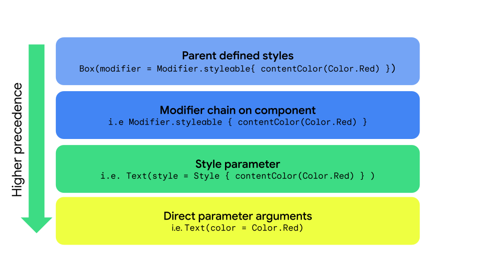 **Figure 4.** Style propagation with `Style`, `styleable`, and direct parameters.
| Priority | Method | Effect |
|---|---|---|
| 1 (Highest) | Direct arguments on a composable | Overrides everything; for example, `Text(color = Color.Red)` |
| 2 | Style parameter | Local style overrides `Text(style = Style { contentColor(Color.Red)}` |
| 3 | Modifier chain | `Modifier.styleable{ contentColor(Color.Red)` on the component itself. |
| 4 (Lowest) | Parent styles | For properties that can be inherited (Typography/Color) passed down from the parent. |
> [!NOTE]
> **Note:** Multiple chained `Modifier.styleable` modifiers are additive with non-inherited properties on the applied composable, similar to having multiple modifiers defining the same properties. For inherited properties, these are overridden; the last `styleable` modifier in the chain sets the values.
### Parent styling
You can set text properties (such as `contentColor`) from the parent composable,
and they propagate to all child `Text` composables.
```kotlin
val styleState = remember { MutableStyleState(null) }
Column(
modifier = Modifier.styleable(styleState) {
background(Color.LightGray)
val blue = Color(0xFF4285F4)
val purple = Color(0xFFA250EA)
val colors = listOf(blue, purple)
contentBrush(Brush.linearGradient(colors))
},
) {
BaseText("Children inherit", style = { width(60.dp) })
BaseText("certain properties")
BaseText("from their parents")
}
```
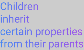 **Figure 5.** Child composables' property inheritance.
### Child override of properties
You can also set styling on a specific `Text` composable. If the parent composable
has styling set, the styling set on the child composable overrides the
parent composable's styling.
```kotlin
val styleState = remember { MutableStyleState(null) }
Column(
modifier = Modifier.styleable(styleState) {
background(Color.LightGray)
val blue = Color(0xFF4285F4)
val purple = Color(0xFFA250EA)
val colors = listOf(blue, purple)
contentBrush(Brush.linearGradient(colors))
},
) {
BaseText("Children can ", style = {
contentBrush(Brush.linearGradient(listOf(Color.Red, Color.Blue)))
})
BaseText("override properties")
BaseText("set by their parents")
}
```
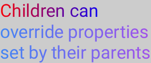 **Figure 6.** Child composables override parent properties.
## Implement custom Style properties
You can create custom properties that map to existing Style definitions by using
extension functions on the `StyleScope`, as shown in the following example:
```kotlin
fun StyleScope.outlinedBackground(color: Color) {
border(1.dp, color)
background(color)
}
```
Apply this new property within a Style definition:
```kotlin
val customExtensionStyle = Style {
outlinedBackground(Color.Blue)
}
```
Creating new styleable properties is unsupported. If your use case
requires such support, submit a [feature request](https://issuetracker.google.com/issues/new?component=612128).
## Read `CompositionLocal` values
It's a common pattern to store design system tokens within a `CompositionLocal`,
to access the variables without needing to pass them as parameters. Styles
can access `CompositionLocal`s to retrieve system-wide values within a style:
```kotlin
val buttonStyle = Style {
contentPadding(12.dp)
shape(RoundedCornerShape(50))
background(Brush.verticalGradient(LocalCustomColors.currentValue.background))
}
```